Goldsack Harris

wellington 1999
The space selected for the Goldsack Harris advertising agency was previously administration offices for the DIC department floor and had undergone seismic strengthening with the introduction of substantial steel diagonal braces. Our commission involved the refurbishment of the space including provision of electrical and lighting services, toilets and plumbing facilities, ventilation, and floor coverings.
Goldsack Harris was interested in providing work space which encouraged team work and creative thought. In their previous office they had operated in an entirely open-plan environment and they were committed to this configuration. Nevertheless the previous office had some significant operational failings and these were addressed in the new office. This included the provision of four slightly separate ‘creative alcoves’ which offer a degree of acoustic and physical separation from the general office.
Central to this project was a planning solution to allow transparency within a large space. The location of meeting and quiet rooms, the creative alcoves and a large utility space centrally as a ‘rock in the river’ serves to physically connect different functional areas whilst maintaining their visual separation. Visitors, for example are generally able to be contained within the reception and café zone without need for card access doors due to the psychological threshold created by the central spaces. Pathways and view shafts through this central core maintain links between the public and private zones.
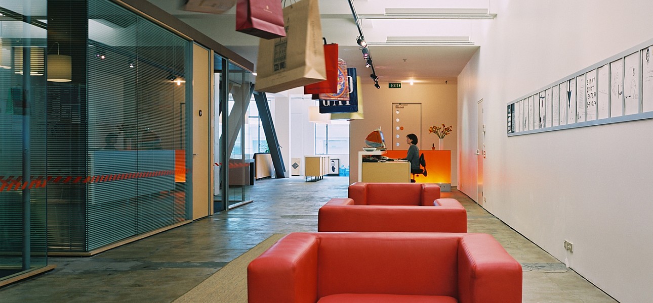
The reception is a long linear gallery space and serves many functions from conventional greeting and waiting to display and promotion. The café and recreational spaces are located centrally, functioning both as a relaxation space as well as an informal meeting and work space. Located adjacent to the open kitchen and on the main circulation route, it is designed to encourage casual discussions.
Open plan workspace is provided for both permanent staff and consultants. The absence of walls and visual barriers allows unrestricted communication. Low divisions incorporating power and data cabling and shelving help to define the space and create personal individual space.
The fabric of the existing space is a vital part of the tectonic character of the office. New and old materials are typically neutral or natural coloured. Where colour is added it is consistent with the accent colours, orange and green, used in the Goldsack Harris corporate identity.


