Ocean Design

wellington 1994-1995
Ocean Design is a graphic design consultancy, which previously traded under the name Attwood associates, and which due to increased workload and staffing required new premises. At the time we were commissioned they had a staff of about 5 or 6 but required space for growth so that at least twice these numbers could be accommodated.
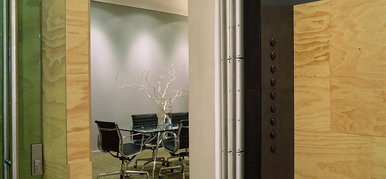
Work areas are located around the perimeter utilizing a continuous plywood workdesk. This allows a variable number of staff to occupy the desk by simply expanding or contracting the amount of it that they use.
The interior is light filled from extensive glazing on two sides and has a spacious feeling enhanced by the placement of partition walls and material and colour selection.
There are very few partition walls and these were carefully located to define space and provide screening. Their placement allows the walls and columns to remain independent in a ‘free plan’ influenced by projects such as Mies’ 1930 Barcelona Pavilion. We have adopted this approach on many projects – Ponatahi House is another example.
The character and identity of Ocean Design is graphically and strongly enhanced by the use of marine charts as ‘wallpaper’ on the major wall surface in the entrance and reception space.
A budget of $50k necessitated the creative use of inexpensive materials and construction techniques. The only extravagance was the use of white terrazzo slabs for the kitchen bench and floor, and reception counter and seat. These accounted for about 20% of the budget.
Ocean outgrew the space and in 2007 moved into much larger premises that we have also designed.


